Vote On A New Logo And Motto For TruckingTruth!
Topic 4332 | Page 4
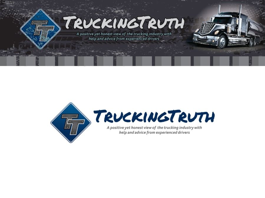
Ok, we have a winner! We actually had a tie between two of them and we've chosen one as the winner. But during the voting process I got a ton of great feedback from everyone about what improvements they'd like to see and I incorporated several of them into the final design. The voting and the feedback were a tremendous help and significantly improved the final product. So thanks a ton for your help in shaping the way TruckingTruth will look in the near future!
So without further ado, here's the new header and logo. The header is the top image and that's what will be at the top of every page. The bottom one is just the logo itself and can be used anywhere. You can click on the image below to see a larger version of it:
....and of course we can now finally start making hats, T-shirts, vinyl graphics, or anything we like.
The website itself is going to be redesigned around the new logo and header but I'm not sure how long that might take. Likely a few weeks at least. But it's going to look amazing, that's for sure!
So thanks again everyone for helping out so much!

HOS:
Hours Of Service
HOS refers to the logbook hours of service regulations.
Not the one I liked best but I do really like this one! Can't wait to see the new site!

Righton! It looks great!
I still like the "...positive yet honest view of trucking ..." tag line, too. No need to fix what already works.
-mountain girl

I still like the "...positive yet honest view of trucking ..." tag line, too. No need to fix what already works.
I'm glad to hear that. Daniel mentioned keeping it and I thought it sounded ok anyhow so I figured what the heck.


The website itself is going to be redesigned around the new logo and header but I'm not sure how long that might take.
Any new updates on the update?
New Reply:
New! Check out our help videos for a better understanding of our forum features


Preview:
This topic has the following tags:
Advice For New Truck Drivers Becoming A Truck Driver


 TT On Facebook
Cool my pick is winning!
Sober-J over